วิธีทำก็ง่ายๆ
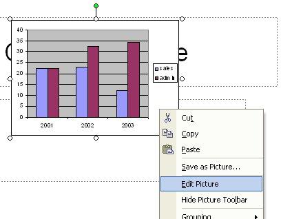
- import กราฟ (copy) เข้ามาก่อนโดยเลือกให้ import as picture
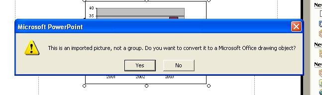
- คลิกขวาเลือก Edit picture แล้วตอบ OK เมื่อมันถามว่าจะให้เปลี่ยนเป็น drawing object ไหม
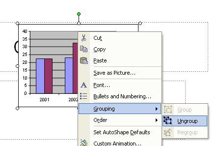
- แล้วก็ ungroup
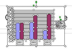
- แก้ไขแต่ละ element ได้ตามสะดวก

 blog ไว้กันลืม เพราะต้องทำอีกเยอะ -_-'
According to my last post, I still have to use Office as my authoring tool for my honey's paper so far. After she sent the PowerPoint file of result with charts , her supervisor had many comments on the charts and it's my job to edit them -_-'. I did embed the chart to the PowerPoint slide as picture format not the excel object but surprisingly, my honey did observe that the charts in the return file were edited partly as an example (for me to correct them all). How did he do that!?
So, I have to look at it and see what was happened. The chart was converted to PPT Drawing objercts that were grouped together. After ungroup them, the chart was separated to many lines, boxes and text boxes so that it is quite easy to adjust these chart elements without hassles of excel object. Of course, I did try it in the Word document and it works. And it is the reason that why the charts in other lab group colleagues' presentation slides were strangely dismembered to small elements (I did think that they draw them themselves at the first place -_-", what a very stupid thing).
The steps to achieve this are:
- Import (copy) the chart from Excel as picture
- Right click at the chart and select "Edit Picture" and OK when PPT ask if it will convert the picture to drawing object
- Ungroup them
- Edit each element as you wish
No comments:
Post a Comment